|
||||||
| Log-in/register to unlock all the member quick-links and features! |
 |
|
Join Date: May 2008
Location: Birmingham, UK
Posts: 365

 |
Musician Promotion - Meg O'donnell
I'm currently working towards finishing my degree and for my final project I am looking towards band/solo musician promotion. I've been building a network of people in a hope to build a diverse and interesting portfolio at the end of it.
Yesterday I met up with a young singer/songwriter called Meg O'donnell. Prior to meeting to shoot we had met up and discussed ideas.
Below are some images from the test shoot, feedback is welcomed.
One point I will raise is that of her facial expressions, she herself admitted she had trouble posing her face so that's something I need to tackle when we next shoot.
1.
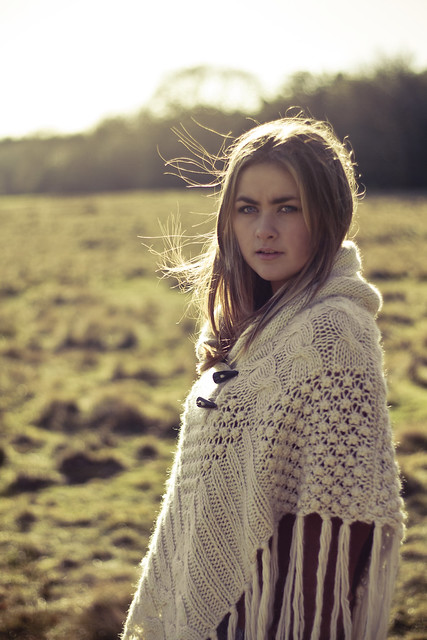
Meg O'donnell - Singer/Songwriter by daniel.hodson., on Flickr
2.
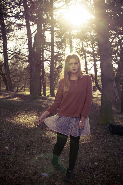
Meg O'donnell - Singer/Songwriter by daniel.hodson., on Flickr
3.
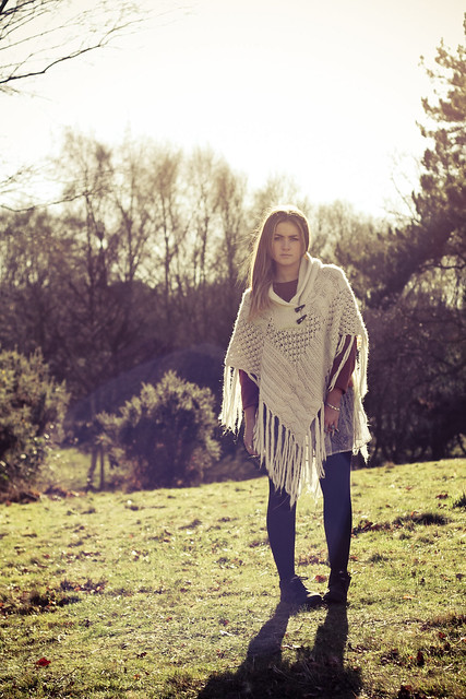
Meg O'donnell - Singer/Songwriter by daniel.hodson., on Flickr
4.
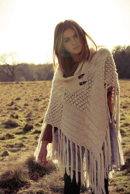
Meg O'donnell - Singer/Songwriter by daniel.hodson., on Flickr
Yesterday I met up with a young singer/songwriter called Meg O'donnell. Prior to meeting to shoot we had met up and discussed ideas.
Below are some images from the test shoot, feedback is welcomed.
One point I will raise is that of her facial expressions, she herself admitted she had trouble posing her face so that's something I need to tackle when we next shoot.
1.

Meg O'donnell - Singer/Songwriter by daniel.hodson., on Flickr
2.

Meg O'donnell - Singer/Songwriter by daniel.hodson., on Flickr
3.

Meg O'donnell - Singer/Songwriter by daniel.hodson., on Flickr
4.

Meg O'donnell - Singer/Songwriter by daniel.hodson., on Flickr
|
Kit 1 Canon 7D Canon EF-S 15-85mm f/3.5-5.6 IS USM Canon EF 50mm f/1.8 II Canon Speedlite 430ex II |
Other Kit View my profile to see my other kit! |
|
My Compact/P&S: Nokia N95 8gb - 5.0mpx |
|
Join Date: Sep 2007
Location: UK
Posts: 1,880
|
I like number 1 best, i would like it even more if she can soften her expression as she looks like she is frowning in most of them, but understand what you have said about her not knowing how to pose.. it isn't easy. I like the lighting with the sun behind, but i would be careful of the glare as it sits across her face in 2 and 4 unless you wanted it in there. It is strange as in 3 the glare sort of adds to the image in my opinion anyway.
Get her to look at other models posing in similar shots, do a google search and loads will come up .
.
Get her to look at other models posing in similar shots, do a google search and loads will come up
|
Join Date: Sep 2007
Location: South Wales, UK
Posts: 15,385

 |
1 2 4 are my faves - in that order. Nice work Dan!
|
Kit 1 Nikon D300 Nikon 55-200mm VR |
Kit 2 Nikon D40 Nikon 18-55mm |
|
|
My Compact/P&S: Panasonic Lumix TZ7 |
|
Senior Member
 |
Join Date: Sep 2007
Location: east sussex
Posts: 3,484
|
Dan
As you have asked for a CC I don't know if this may work better for her and you
Maybe if a prop was used of some sort, ie the classic (lean against/backsupport) use of a tree for the natural look, also her holding sun glasses if she has hand position worries.
As the facial expression has already been mentioned I don't know if mentioning about one shoulder being higher than the other and the foot position is permitted, but it doesn't help with the stance. If I were you (and I bet your glad your not ) what may help is to take a magazine with models posing in it, and try to get her to imitate the way they do it. Preferably with photos in the same type of environment, ie outside wooded shots. A direct comparison on the shoot should should be of help to both yourself and the girl. I was thinking that she poses and you held the mag photo by the camera and see what is going wrong then correct, it even if it means physically moving her position yourself.
Just one other thing to be careful of. In the second picture a bag is left in shot on the ground to the right of the picture. To my mind this should be out of shot entirely. So just watch out for objects that shouldn't be there.
I have noticed "flare" creeping in , and on the last 3 photos its right across the young lady, faintly admittedly, but is that what you really want? for me it doesn't enhance the photos.
Still I suppose you have already been told all this on your degree course and my thought and ideas are worthless.
See I didn't fail the entrance exam to idiot school for nothing.
Bazza
l
As you have asked for a CC I don't know if this may work better for her and you
Maybe if a prop was used of some sort, ie the classic (lean against/backsupport) use of a tree for the natural look, also her holding sun glasses if she has hand position worries.
As the facial expression has already been mentioned I don't know if mentioning about one shoulder being higher than the other and the foot position is permitted, but it doesn't help with the stance. If I were you (and I bet your glad your not
Just one other thing to be careful of. In the second picture a bag is left in shot on the ground to the right of the picture. To my mind this should be out of shot entirely. So just watch out for objects that shouldn't be there.
I have noticed "flare" creeping in , and on the last 3 photos its right across the young lady, faintly admittedly, but is that what you really want? for me it doesn't enhance the photos.
Still I suppose you have already been told all this on your degree course and my thought and ideas are worthless.
See I didn't fail the entrance exam to idiot school for nothing.
Bazza
l
|
Join Date: Sep 2007
Location: UK
Posts: 4,033

 |
I like her facial expression. It looks natural and not forced, but I will agree that her foot does look awkward - particularly in #2, which I would find to be my least fav - due to her stance, and the positioning of the sun directly above her head - its too distracting. That said, your processing works well for this style - looks wonderfully vintage and there is something very haunting about #1, which makes it my favorite of the bunch!
|
Join Date: May 2008
Location: Birmingham, UK
Posts: 365

 |
Quote:
Dan
As you have asked for a CC I don't know if this may work better for her and you
Maybe if a prop was used of some sort, ie the classic (lean against/backsupport) use of a tree for the natural look, also her holding sun glasses if she has hand position worries.
As the facial expression has already been mentioned I don't know if mentioning about one shoulder being higher than the other and the foot position is permitted, but it doesn't help with the stance. If I were you (and I bet your glad your not ) what may help is to take a magazine with models posing in it, and try to get her to imitate the way they do it. Preferably with photos in the same type of environment, ie outside wooded shots. A direct comparison on the shoot should should be of help to both yourself and the girl. I was thinking that she poses and you held the mag photo by the camera and see what is going wrong then correct, it even if it means physically moving her position yourself.
Just one other thing to be careful of. In the second picture a bag is left in shot on the ground to the right of the picture. To my mind this should be out of shot entirely. So just watch out for objects that shouldn't be there.
I have noticed "flare" creeping in , and on the last 3 photos its right across the young lady, faintly admittedly, but is that what you really want? for me it doesn't enhance the photos.
Still I suppose you have already been told all this on your degree course and my thought and ideas are worthless.
See I didn't fail the entrance exam to idiot school for nothing.
Bazza
l
As you have asked for a CC I don't know if this may work better for her and you
Maybe if a prop was used of some sort, ie the classic (lean against/backsupport) use of a tree for the natural look, also her holding sun glasses if she has hand position worries.
As the facial expression has already been mentioned I don't know if mentioning about one shoulder being higher than the other and the foot position is permitted, but it doesn't help with the stance. If I were you (and I bet your glad your not
Just one other thing to be careful of. In the second picture a bag is left in shot on the ground to the right of the picture. To my mind this should be out of shot entirely. So just watch out for objects that shouldn't be there.
I have noticed "flare" creeping in , and on the last 3 photos its right across the young lady, faintly admittedly, but is that what you really want? for me it doesn't enhance the photos.
Still I suppose you have already been told all this on your degree course and my thought and ideas are worthless.
See I didn't fail the entrance exam to idiot school for nothing.
Bazza
l
She does photography herself so I'm more than sure we'll be able to get them right.
and as for
Quote:
my thought and ideas are worthless.
|
Kit 1 Canon 7D Canon EF-S 15-85mm f/3.5-5.6 IS USM Canon EF 50mm f/1.8 II Canon Speedlite 430ex II |
Other Kit View my profile to see my other kit! |
|
My Compact/P&S: Nokia N95 8gb - 5.0mpx |


